
View this post on Instagram
{Source: Collab Sign & Design. Back Alley BBQ. Chandler, AZ. Not a franchise; darn good sign usage!}
A franchise storefront is not experienced from one perfect angle.
Customers see it while moving. Someone may notice the business from the road. Another person may walk past from the side. A customer may park, look for the entrance, and check the glass before stepping inside. Once they enter, the space still needs to feel connected to the brand they saw outside.
That is why one sign is rarely enough.
The main sign above the door is important. It helps customers recognize the franchise and find the location. But a storefront has more than one job. It needs to be seen from different angles, understood up close, and carried into the customer experience.
A stronger franchise storefront uses layered signs. Channel letters, blade signs, window vinyl, and lobby signs should not feel like separate pieces added one by one. They should feel connected, each one supporting a different part of how customers find, approach, and experience the business.
The goal is not to add more signs just to fill space. The goal is to make each sign earn its place.
The Sign Above the Door Sets the First Expectation
For many franchise storefronts, channel letters are the main sign people notice first. They sit on the building, carry the franchise name, and create the first clear moment of recognition.
This is the sign that tells customers, “You found the right place.”
That role matters. A franchise needs to feel familiar and easy to identify, especially when customers are looking for a brand they already know. The letter style, color, scale, and lighting all need to support that recognition.
But channel letters should stay focused. They are not the place for every promotion, service detail, instruction, or temporary update. When too much gets added to the main sign, it can lose the clarity that made it valuable in the first place.
The main sign should anchor the storefront. The other signs should support the moments that surround them.
Customers Do Not Always Approach From the Front
A storefront may look clear from straight ahead, but that does not mean every customer will see it that way.
In real life, people approach from different directions. They may be walking along a row of shops, entering from a parking lot, or moving through a busy retail center. Sometimes the main sign is partly blocked. Sometimes the customer is already close before they realize they need to look up.
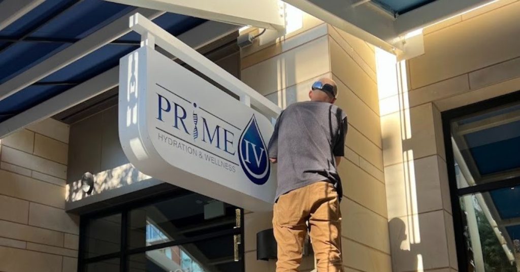
This is where blade signs can help.
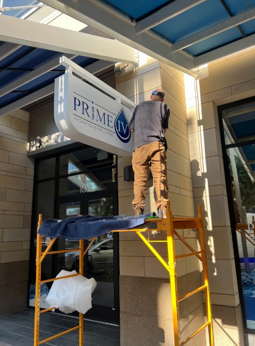
A blade sign projects outward from the building, making it easier to spot from the side. It gives nearby customers another visual cue when the main sign is not in their direct line of sight.
For franchise locations in plazas, downtown areas, lifestyle centers, or walkable retail spaces, side-angle visibility can make the storefront easier to find. The blade sign does not need to say everything. It simply helps customers notice the business when they are passing by.
It is a small part of the sign package, but it can make the customer’s path feel much clearer.
The Entrance Needs a Different Kind of Message
Once customers are close to the door, they no longer need the storefront to introduce itself in the same way. They already found the business. Now they need smaller cues.
This is where window vinyl can support the entrance.
Window vinyl can hold the messages that do not belong on the channel letters or blade sign. It may show a simple campaign message, a short service cue, store hours, privacy graphics, or a branded detail that makes the entrance feel more complete.
The key is control.
Window vinyl should not turn the glass into a crowded message board. It should help the entrance communicate clearly. A customer standing near the door should be able to understand the message quickly, without feeling like the storefront is trying to say too much at once.
Used well, window vinyl supports the storefront. Used carelessly, it competes with it.
That difference matters.
The Brand Should Continue Inside
The storefront experience does not stop when the customer opens the door.
A customer walks inside and immediately starts forming another impression. Does the interior feel professional? Does it match the brand outside? Does the space feel finished?
Lobby signs help answer those questions.
A lobby sign brings the franchise identity into the interior. It can be dimensional, illuminated, acrylic, metal, wood, or designed around the brand’s approved materials and style. The exact format depends on the business and the space, but the purpose is the same: it carries the brand experience inside.
This is especially important for franchises where customers wait, check in, order, meet staff, or spend time inside the location. The lobby sign does not have to be oversized or dramatic. It just needs to feel intentional.
The storefront invites people in. The lobby sign confirms that the experience continues.
Each Sign Should Have a Clear Role
More signs do not automatically mean better signage.
A storefront can have several signs and still feel confusing if they are not planned together. One sign may be too loud. Another may feel disconnected. The glass may have too much information. The lobby may feel like an afterthought.
The stronger approach is to give each sign a clear role.
| Sign Type | Role in the Storefront |
| Channel letters | Create front-facing brand recognition |
| Blade signs | Help customers notice the business from side angles |
| Window vinyl | Support the entrance with timely or practical information |
| Lobby signs | Continue the brand experience inside |
This is what keeps a franchise storefront from feeling crowded.
Each sign does not need to repeat the same message. In fact, it should not. The channel letters identify the business. The blade sign helps customers approach from another angle. The window vinyl handles close-up communication. The lobby sign carries the brand inside.
When every piece has its own purpose, the storefront feels easier to understand.
A Good Storefront Has a Natural Handoff
A strong franchise storefront has a rhythm.
The customer sees the main sign and recognizes the business. As they move closer, another sign may help guide them from the side. At the entrance, the window details give them the next piece of useful information. Inside, the lobby sign continues the brand experience.
Nothing feels random. Nothing feels forced.
That is the difference between adding signs and planning signage.
Adding signs can fill space. Planning signage creates a natural handoff from one moment to the next. It helps the customer move from recognition to arrival to entry without confusion.
This is especially important for franchises because the brand needs to feel consistent, but each location still has its own building, layout, and customer flow. A sign package should respect the franchise identity while also responding to how people actually experience that specific storefront.
One Sign Can Start the Story, But It Cannot Finish It
The sign above the door is important. It gives the franchise a face on the building and helps customers recognize the location. But a storefront is more than that first moment.
Customers need to find the business, approach it, understand the entrance, and feel the brand’s presence once inside. One sign can start that process, but it should not be expected to carry all of it.
That is why channel letters, blade signs, window vinyl, and lobby signs work better when planned as a single storefront system. Each piece supports a different part of the customer’s movement, from the first glance outside to the first impression inside.
That is the approach behind our work at Collab Sign & Design. Our goal is not to cover a franchise location with more signs. It is to make every sign earn its place. When the right pieces are planned together, the storefront feels clearer, more connected, and easier for customers to understand.
One sign can help customers recognize the business. A thoughtful sign system helps the whole storefront work.


